Welcome to our series exploring quilting basics! We left off with a look at picking a pattern. Next time, we’ll be exploring the basics of selecting fabric. For an overview of the series, you can check out all of the posts here.
Hi friends!
Color. Picking the colors and fabrics for a quilt can be daunting. Ever look at a quilt and think, that looks good but I wouldn’t know how to put those colors together? How many times have you heard a quilter say (or maybe you have said it yourself), “I’m not good at putting color/fabric together”?
Many quilters are afraid of choosing the wrong color. Or the wrong fabric. Which is why kits and precuts are so popular! Someone else has put all the colors and fabrics together for us.
Choosing a color scheme and picking fabrics, while they go hand in hand, are 2 different things so we decided to split the blog post into 2 parts: one about color and one about fabric.
When I was chatting about picking a pattern in the last post, I mentioned many of us are first drawn to a pattern based on the colors and fabrics the pattern designer used. And because we like how the designer put the colors and fabrics together, we often want to make it exactly they way the designer made it!
But we can’t always get that exact fabric and then comes the worry we can’t pick our own fabric and make the quilt look good. But you can. You can learn to mix colors, it just takes a little understanding of color theory and practice!
(Remember when your momma said to practice your reading, or practice the piano, or…. momma knows best! Practice!)
And yes, this post gets pretty technical. But knowing about color theory really will help when picking fabrics- and that’s the fun part! So let’s talk color.
Color Theory Terms
There is a saying in color theory that value does all the work but color gets all the credit! Let’s explore color theory a little bit and talk about how color, hue and value can affect our quilt.
First, what do some of the terms mean?
Hue is another word for color. We could get into deep detail on how the definition of the word hue really refers to the color family and therefore differs from color, but really, for most of us, hue means color.
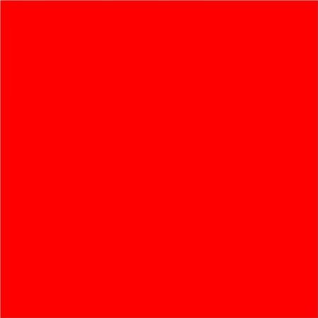
Other terms you might hear when talking about color are shade, tint and tone.
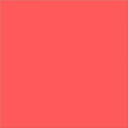
Tint is the mixture of a pure color with white. It lightens the original color.
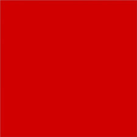
Shade is a pure color mixed with black and therefore is darker than the original color.
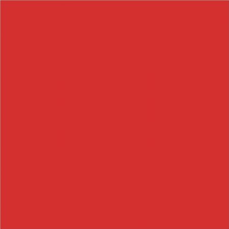
Tone is when the color is mixed with grey.
Fairly easy so far right?
Another important color term is value.
Value refers to the relative lightness or darkness of a color. And I said relative because a color can change from light to dark depending on what other colors it is next to in a project.
Here is a light green square.

When put next to a darker green and a yellow, it becomes the medium value.
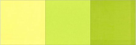
When put next to 2 greens of darker value, it is the light.
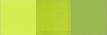
Value contrast in a quilt can make or break the design. I mean, why create intricate star blocks if you can’t see them?
On the other hand, low volume quilts are popular and they can be very pretty with a soft, low contrast look. But a low volume color scheme does not always work when your quilt has an intricate design.
Picking a Color Scheme
We probable all have a “go to” color scheme. I know if left to my own devices, I favor blues and greens. And my fabric stash at home has a lot of medium value fabrics in it. But if I want my quilt to pop, I need to enlarge my palette, get some value change going on and maybe stretch and add a pop of a color that I may not have picked on my own, but based on a color harmony, is the perfect color to pop in my quilt!
There are different ways to create a color scheme for your quilt. First pick the main hue or color family that you want to use. A good color scheme for a quilt often has one main color family to provide structure.
For my examples, I picked cerulean blue. (Blue? Shocking I know!)
Second decide if the color scheme is monochromatic, which means using colors only from that color family, or if you plan to mix colors. If mixing, there are ways to mix color to give you some structure to help you pick colors for your quilt.
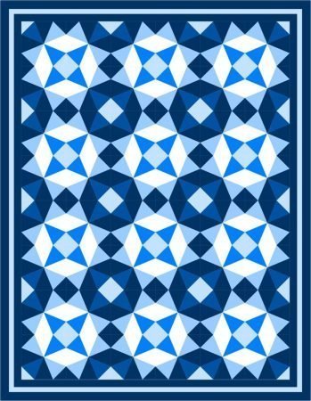
Some of the popular color combinations for mixing colors are called complementary, analogous, split complementary and triadic. There are others, but these work well for quilts.
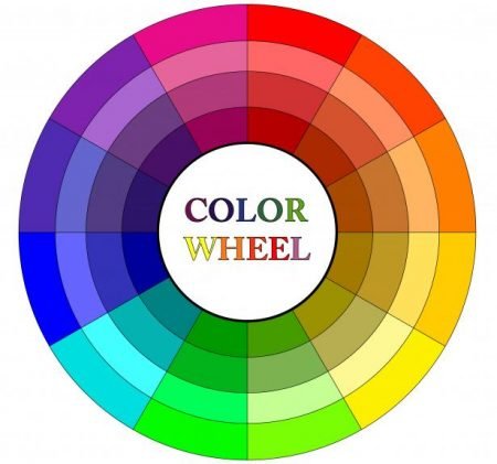
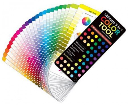
To use these color combinations, a color wheel is really helpful. It provides a visual of what works. I love this color tool by Joen Wolfrom for C&T Publishing because it fits in my purse!
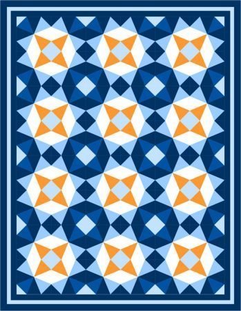
A complementary color scheme uses 2 colors opposite each other on the color wheel. It is best to choose one of the colors as the primary color family in your quilt and then use the complimentary color as a pop of color.
An analogous color scheme uses colors next to each other on the color wheel. Start by picking the main color and then choose colors on each side of the main color. You could pick a total of 3 colors, or 5 colors or even 7 colors!
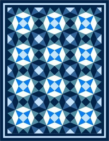
A split complementary color scheme combines the analogous color scheme with the complementary scheme. You start with your analogous scheme and then choose the complementary color based on the center color of the analogous scheme.
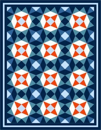
And then there is the triadic color scheme. It is 3 colors on the color wheel that are equal distance apart; you pick your main color family and then find the 2 other colors. For this to be successful, you want to have one main color family and use the other 2 to add pops of color.

Here is the triadic color scheme with the pop fabrics in different spots. Changes the way the quilt looks, right?
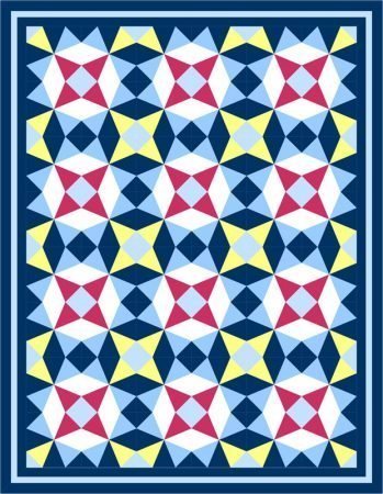
This brings us to another concept in color theory: color temperature. There are warm colors and there are cool colors. Look at a color wheel. Warm colors are the colors on the red and yellow side of the wheel and cool colors are on the blue and green side of the wheel. I think of them as the colors of a summer day- the sun is hot and the water is cool!
What difference does the color temperature make when choosing colors? Warm colors are vibrant and have energy- they will pop in a quilt. Cool colors are more restful and peaceful and will recede in a design. So, for example, let’s say you are adding yellow to your quilt, and since you are not used to adding yellow, you decide to put it in a small random part of the block. Then once you make the block, you don’t like it. It is probably because that part of the block stood out and the part of the block you wanted to stand out didn’t. So if it should not pop, don’t put a warm color there!
Here is my quilt Urban Twist shown in solids and in this color scheme the yellow and black stand out. For 2 different reasons; the black due to value; the yellow because it is a warm color. The star is not the stand out of the block, the slashes of black and yellow are the stand outs. Which is OK! I like it that way. But maybe you want the star to stand out more.
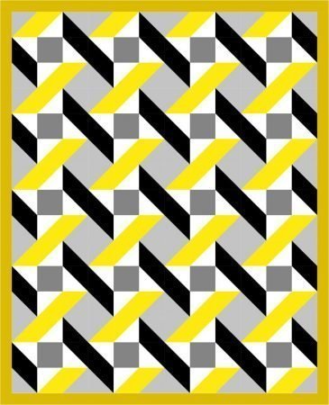
So let’s move the yellow around in the quilt. Moving the yellow to the small triangles creates yellow squares when the blocks come together. The stars stand out more but those yellow squares take over a little bit, right?
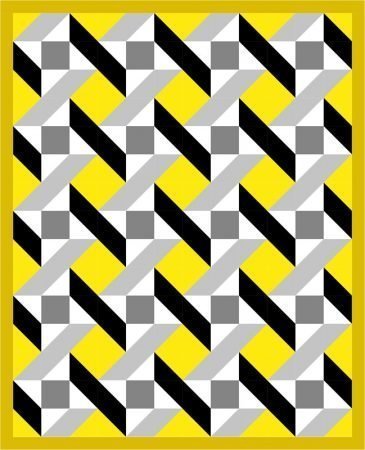
Now lets move the colors around again. Here I swapped the yellow, white and the grey.
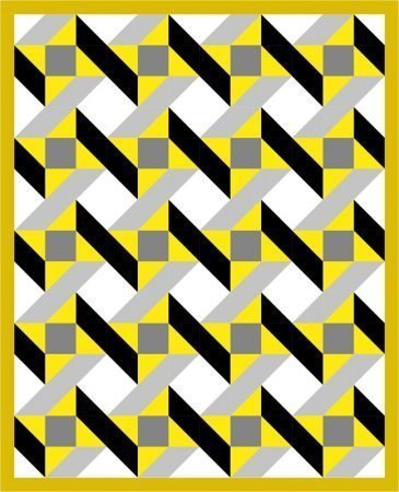
Here I swapped only the white and yellow.
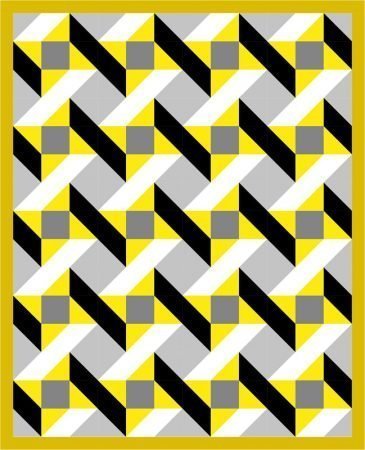
What these quilts show is that where the colors are in the quilt makes a huge difference! And there is not a right and wrong. It is what you like. I am not a fan of the version with the yellow squares, but maybe you like that one. There is no right or wrong as we all like different things. The idea is to realize color theory is not just about the color scheme but also about where those colors go in the quilt and the impact on the design.
Overwhelmed? Color theory can be learned. Start small. There are great books and videos and blog posts on color. I love carrying that small color wheel with me when I am picking out fabrics; it really helps me determine what I need to make that quilt pop. And remember, like anything else, the more you work with color, they better you will get!
In the next post, we will explore actually picking fabrics and talk about how to apply all this color theory.
And yes, because I have EQ8, I can try out color palettes on my computer but when I am in a quilt shop, all I have is me and my color wheel!
Last but not least, when picking colors for your quilt remember a couple of things. First, value is one of the most important things to keep in mind. And second, you need to go with your gut. We don’t all see color the same way so, what your friend likes may not appeal to you. Be brave, try new color schemes and make beautiful quilts!
Have thoughts on color or questions on any of the concepts here? Post a question in the comments. I would love to hear your thoughts.
happy quilting,
Kate
Post updated on August 14th with Additional Resources!
Friends, I was recently contacted by Canva and they have a great color tool on their website called Color Theory by Canva. You pick a color, pick if you want a complimentary color scheme, an analogous color scheme…. and then it shows you the colors to consider. How cool is that?!?
You could pull it up on your phone when you are at the quilt shop. Click here to play.
AND, I just read a great article in the August/September Quilting Arts magazine on color.
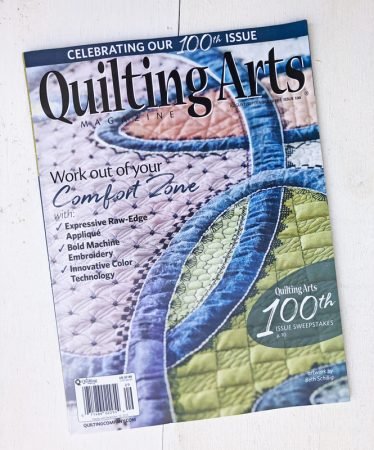
The author, Steph Skardal, even showed color wheels of each of the major fabric manufacturer’s solid lines. Very cool to see. Check out the article in the magazine or go to her website here and check out her interactive color tool. It is amazing! And, if you really want to explore color more, she has some blog posts on color that are terrific.
~K

For me deciding colour combo is the most difficult task. Ur article is proving so useful for me. Thank u so much.
Glad this was helpful!
Happy quilting!
Thanks so much for the color wheel by Canva! I just tried it, so neat. I am a novice, and found your article very interesting and helpful.