Welcome to our series exploring the basics of quilting! Last time, we discussed ways to choose a color scheme. Next time, we’ll be looking at precuts. To see all the posts in this series, click here.
Hi friends!
I hope you have been enjoying the Exploring the Basics blog post series. Today we are moving on to Selecting Fabric for your quilt.
Starting with a Color Scheme– Last time we chatted about picking a color scheme which may seem the same as selecting fabric, but it is almost easier to pick fabrics once you have a color scheme. There are so many fabric options at the local quilt shop. It can be overwhelming.
If you missed the post on color- click here to check it out. If you already saw it, you may want to go back and check out the end of the post because I updated it with a couple of cool resources for help with color.
To make the process a little easier, if you already have an idea of your color scheme, then you can eliminate any fabrics that may catch your eye but don’t work in your color scheme.
Sounds good in theory, right?
So how do you start selecting fabrics for your quilt? Many people will tell you to find the big print – one that you can use for your border or the main print in the blocks of the quilt. Then you can pick all the rest of the fabrics using the dots of color along the selvedge of the print.
The problem with that is it may not include a nice contrast fabric to give your quilt that pop and variety that makes a quilt sing! It might but … it might not. Hopefully, if you already researched your color palette and know what other colors you need, you can use the dots along the selvedge to help with fabric selection but not be your only options.

Starting with a print in your color palette can be helpful. I have found that sometimes I might pick a wonderful print that I just love, I use it to select the rest of my fabrics and then I realize that the print doesn’t actually work in the quilt. Oh no!
Really, that is OK! You can use it as the backing fabric or maybe use it in another quilt. The nice thing is the print got you started selecting fabrics- which is sometimes the hardest part.
Using a Collection– One easy way to pick fabrics for a quilt is to stay all within a collection. The fabric company and the fabric designer already made all those color decisions for you! So use their expertise but a great way to up the design is to add a pop of a fabric from another collection or company. Sometimes that off beat addition is just what you need to add interest to your quilt so it does not become matchy=matchy.
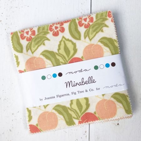
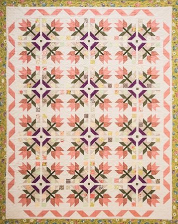
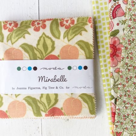
For my quilt Gardenesque, I started with a Charm Pack. Of course, that is because the book is all about precuts! Precuts are another great way to get started- we will chat more about using precuts next time.
What are some of the things to think about as you choose your fabrics?
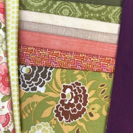
Scale– think about the over size of the print in each fabric. You want a mix of scales: smaller prints, larger prints, maybe consider adding a fun dot, check or stripe for interest.
Smaller scale prints will help show off the larger scale prints. And, if the fabrics are all the same scale, you will need to really think about other ways to add interest and allow design elements to stand out.
You can see how I added another larger print, a small print and then a geometric.
Value– when picking your color scheme, you want to grab a range of values within the colors. So, if for instance, your color scheme is complimentary- and you are using coral and blue green, be sure to grab fabrics from light to dark in each color. But remember, one color should be the star and you should use more fabrics in that color.

For Gardenesque, there was a lot of green and peachy orange in the quilt. I am not sure if I thought about one being the dominant color but it seems the peachy orange became that if you look at the quilt.
Neutral– if you are using a lot saturated color or big scale prints, it can be a great idea to neutralize the palette with something that is more of a tone on tone. Most people assume when you say a neutral that you need to add white, or cream or for those who go to the dark side, a black or dark grey. All good choices. I happen to love quilts with white backgrounds.

In Gardenesque, I really have 2 neutrals. The soft cream print is the background for the blocks and the borders and I used the darker one for the basket area of the block. I wanted the flowers and the leaves to stand out, not the basket. And making it in a neutral allowed that to happen.
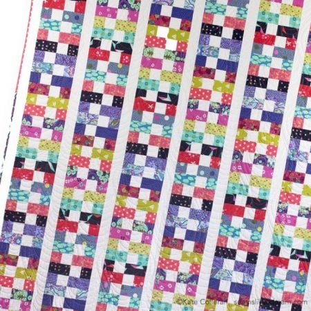
Boston Bricks is a great example of a quilt with lots of busy prints and saturated color. The white allows all those busy prints to really shine!
But depending on your fabrics, your neutral could be a green! Or a blue. Or maybe even a dark purple. What you want is a fabric that is a small print, a tone on tone or a solid to give your eye a place to rest and to allow the rest of the design to stand out.
Pop of Color– Have you ever made a quilt where all the colors match but the quilt is kind of blah? I mean, it is OK but it doesn’t pop the way you want it to? Sometimes we overmatch and forget to add a pop of color.
In Gardenesque, instead of looking to the fabrics for the other dark color I needed, which may have lead me to choose a brown tone, I decided to add a pop of color with the purple. I used the green and peachy orange and found that violet made a triadic color scheme using my color wheel. It added the perfect touch to the quilt.
(And I will admit, I did not have a triadic color scheme in mind when I started the quilt, but using the color wheel did make the quilt better! I am learning… And I will also admit, my purple is more purple than red-violet but it still worked!)
Keep in mind, it’s OK to ask for help! When shopping for fabrics at your local quilt shop, if you browse a bit first, find a fabric or 2 that speak to you and then ask the staff for help, they have a better idea of what you like and can assist you easier.
Remember though, what appeals to the staff at the shop may or may not appeal to you. We all see color differently and we all gravitate to a different palette. But some suggestions may get you moving in the right direction.
Do you have any tips to share on how you pick fabrics for your quilt projects? I know we would all love to get tips! Leave your tips in the comments.
happy quilting,
Kate