Hi friends!
Today I want to talk little bit about choosing quilt colors. One of the hardest things for many quilters is choosing what colors to use in their next quilt.
Does that resonate with you? It does for me!
Choosing Quilt Colors
Picking the right mix of fabrics for your next quilt can be challenging. Sometimes we know exactly what we want and others… It is why quilt kits are so popular or why quilt shop owners want quilt pattern designers to redo their pattern covers with updated fabrics- because quilters often want the fabrics they see on the cover of the quilt pattern!

Hmmm… so how do quilt designers decide what fabrics go where? Many of us use computer programs where we can upload fabric images into designs and see what works. I use EQ8, others use Adobe Illustrator or CorelDraw or…
And that helps! We can see ahead of time what the quilt will look like if we put the bright green fabric here and the dark blue fabric there.
But, using paper and colored pencils also works! I have done that before. Plus, it’s fun! Draft a quilt block and play with colored pencils- if you have no expectations, it is a great way to just unwind! I used to LOVE to color as a kid.

Sometimes, when I am picking fabrics out at a quilt shop, I might lay the bolts down next to each, trying to arrange them to mimic the block.
Some quilters say that they aren’t good at putting fabrics together. But you know what you like! We each have to trust our gut and then apply some color theory to help us choose the right spot for each fabric. Sometimes I get it right and other times… well I could have done a better job with picking and placing the fabrics. But, even when the mix isn’t quite right, the quilt still looks good!
Three Quick Color Tips
Here are 3 color tips that I try to remember when picking fabrics.
Tip 1
Value- I try to remember it is more important to keep value in mind than matching one blue to another blue! Value is what will allow each design element to stand out.
Tip 2
Let go of the fabric! Do you ever pick an inspiration print to help pull together your color palette? I do that but I also have to remember to be willing to realize it may not end up in my quilt top. Say what??? I love that fabric!
Sometimes I fall in love with a fabric and I want it in my quilt top so much, but as all the other fabrics come in to the group, I realize it just doesn’t work. Sometimes letting go of a fabric you LOVE but that doesn’t work is the hardest thing to do. Remember, it may be perfect for the back!
Tip 3
I try to audition the fabrics and lay them next to each other, sort of how they will be in the block. That way I can see if they have enough contrast and movement. I note which pieces intersect and make be sure they work well together. That can be hard to do with bolts of fabric. If I am in a shop, I might see if they have the fabrics in FQs; it is easier to play around with the smaller pieces and I can see what works best before committing to a fabric.
Picking Fabric for the September Block Challenge
This month, for our Instagram Block Challenge, Tammy and I and 11 other designers are reimagining the Strip Star block. I will show the whole process later this month after our reveals on IG but our first post is always our fabric pulls.

Last month and this month, I have been using my newest Signature line from Island Batik called Moonlight Sky, designed for me by Kathy Engle.
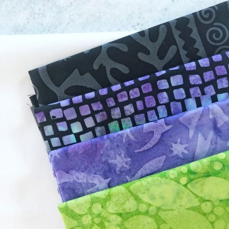
Last month, I use some of the blacks with a pop of green and lavender.

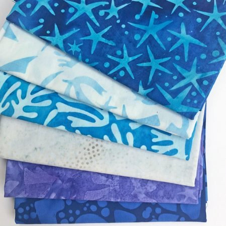
This month, I wanted to use the blues. My first choice was to grab that green- I LOVE the green fabric!- but… I wanted to try another color mix. After some playing around, I ended up with this group.

You can watch my little fabric picking video here!
What is the first thing you notice with my colors? For me, when they are set up in the order in the picture above, I see very little value change between the lavender and the blue. Some, but not a lot.
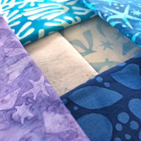
So, will that be a problem? No, because, first, there is more value change in person than that image shows and, in the quilt block, those fabrics are never next to each other! My 4 dark and medium value prints are each next to the lighter fabrics, not each other. They each have great value contrast with the 2 light fabrics.

Do you have any best practice tips for picking the fabrics for your next quilt? If yes, please share them in the comments!
Next week, I will share more of the fabric line Moonlight Sky and some of my new quilts using the fabrics! And later this month there will be another post in our Exploring the Basics series where I will share tips on making the Strip Star block and how we reimagined it!
happy quilting!
Kate